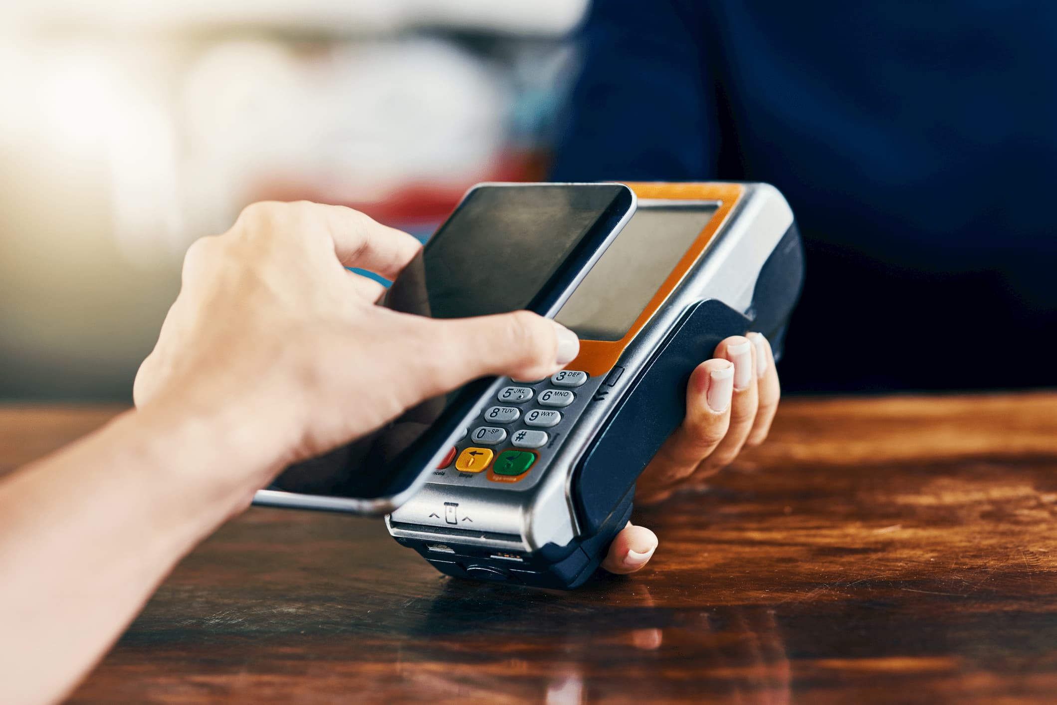
The classic format of user-bank interaction in Europe will be reshaped
The banking structure is fairly old and many transactions are still made offline. You have to go to the bank to pay certain bills, make local and international money transfers, to manage your account.
Fintech companies are stepping in to fix this, creating convenient interfaces, focusing on building a payment user-experience and interaction with banks through an open API.
We are not different, working to make the financial sphere of their lives comfortable and hassle-free thanks to quick, easy and secure service.
A second saved is a penny earned: Creating a new product
After conducting a profound research that covered a number of traditional banks, we discovered that it takes a user around 70 seconds from login to transfer to make a transaction. An average user spends about 10 hours per year on internet banking.
A second saved is a penny earned, so the reduction of transaction time could be game changing. Yet it is not enough to combine all financial functions in one application to cope with this task. A unique UX solution is needed.
Creating a new product requires forging an absolutely new level of interaction. We call it a physical design system.
I am going to share some of the most successful user experience principles that we from the company xpate have used:
Replication of our history of interaction with physical money
Customers have a lasting history of interaction with physical money and objects as parts of daily routine. They transfer it, use it for payment or just give it away. How do they keep money in the physical world? In a stack!
Replication of this behaviour in the online interface is very efficient. In our payment solution money is still kept in stacks, transaction movements remind of the actions users make when dealing with physical funds. A user controls funds with his index finger. Swipes to the right or left allow you to send, receive, exchange money, top up your account, make payouts or split the bill. Direction of swipes should be adopted for right and left-handed users.
Advanced security and fraud monitoring systems
Having dozens of e-mail, social media accounts and bank applications makes remembering all the passwords quite a headache. Overcoming this common obstacle enhances user experience as well. What if the password is no longer required, just a convenient and secure unlock code. Advanced security and fraud monitoring systems that are available nowadays ensure it is still safe.
Our experience shows that storing various account details can be quite confusing as well. So keeping all of them in contacts containing various channels that can be used to make a transfer is certainly worthwhile.
BankingHub-Newsletter
Analyses, articles and interviews about trends & innovation in banking delivered right to your inbox every 2-3 weeks
"(Required)" indicates required fields
Avoiding complicated terms for a better user experience
Avoiding complicated terms also proved to work wonders. Communicate with clients in a way that is convenient for them. Utilising simple, comprehensive vocabulary facilitates onboarding merchants that are yet to deep dive in payment industry specifics.
Warning of unplanned spending
Another important thing to remember is predictability. Every time the transaction is made the our solution makes a guess based on the amounts of previous transactions to a recipient and either suggests autofill or highlights with colour change that there’s an extra zero in the amount. The warning of unplanned spending gives users a confidence boost.
Highlighting every user action
The last but by far not the least is the smooth clean animation highlighting every user action.
Well-designed simplicity pays off in the user experience
We strive to make the financial sphere of people’s lives comfortable and hassle-free thanks to a unique design solution.
Implementing all of the above tips resulted in the creation of the first true drag and drop payment experience in the world and helped us to reduce the time spent on a transaction from 70 to 8 seconds. A year after more than 300 companies processing over 50000 transactions daily utilise xpate to expand their business across frontiers.

